Words by Adrienne Dyer. Photos by Jody Beck. Styling by Hanne By Design.
When they bought it, this 1980s home held a lot of promise for Carsa Construction owners Cody and Christina Arsens as a place to accommodate the evolution of their family. The home had potential to transform into a more contemporary and noteworthy presence on their street while respecting the original structure and vernacular of the neighbourhood.
After simple updates to the upstairs bedrooms, Cody and Christina turned their attention and construction talents to the primary living spaces and the results are a polished, light-filled home that balances a contemporary airy feel within a traditional structure.
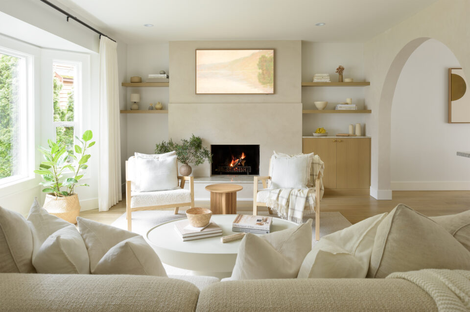
The couple worked with the talented interior designer Bryn Milward to take on the redesign. Together, they chose a palette of neutral materials against warm white walls as a clean canvas where the couple could add their personal touches like original artwork, bespoke lighting and venetian plaster which set the tone for an organic, bright new feel that imbues a sense of calm–important to these busy parents with a toddler and baby.
A series of minimal interventions were made to the original building by stripping back walls to create new archways and allowing more light to penetrate the main floor. Curved archways connect the spaces, and as Christina says, “create a cozy and comfortable living space where people feel welcome and taken care of.” The reconfiguration of the home is defined by these elegant arches, oak millwork and a practical layout that will stand the test of time.
“Finding a balance between modern and traditional was really important to us,” says Christina, who adds that they came from a modern open-plan condo so to buy a home that had never been renovated with very separate living spaces was an adjustment. At the same time, she fell in love with the homey feel of the distinct spaces and decided that she didn’t want an open aesthetic in this home.
“The arches lend themselves beautifully to great sight lines, but they also allow us to feel part of each individual space at a time,” says Christina. “They create an organic feel of something circular- in contrast to all the hard angles of the home- they’re still soft and let in light throughout the house.”
That sense of organic softness is enhanced by touches of Venetian plaster, found in the kitchen above the stove, the fireplace, a feature living room wall and with dramatic effect in the ground floor bathroom. There is an overall approach to materiality that celebrates the raw and the tactile with materials like wide plank oak floors, quartz countertops and venetian plaster.
“Cody had worked with a plasterer before on another project and really wanted to incorporate that detail in our home,” says Christina. “Plaster is really interesting in the way it absorbs light at certain times of the day. And in the bathroom, the green plaster—which has a velvety-look—allowed us to add something more dramatic and creative.”
Rich detail appears in the kitchen as well, where Dave Sheridan of Splinters Millworks lent his craftsmanship to vertical grain oak cabinets full of “sneaky storage,” adds Christina, like the hidden coffee bar and drawers within the island. Sheridan crafted intricate reeded details for the kitchen island and bathroom vanity using individual pieces of wood lined up and secured one at a time. “Cody wanted to add this beautiful and classic feature to add depth and texture to spaces that we want to remain minimal, yet feel special.”
“Minimal, yet special” is a fitting phrase to describe the entire home where Christina and Cody are able to welcome new clients for a showroom experience that is authentic to the perspective of the daily life of this family home. “What’s special about this project is that we were able to execute on something we really believed in and are able to share the results—and the work of the talented tradespeople who contributed—with others. That is a gift.”


