Article by Michelle Heslop. Photos by Rob Campbell.
It’s not very often that a client requests a redesign with no specific vision in mind, giving free reign to the builder. Ryan MacLeod of Citizen Design Build Inc. was appointed to design and construct a renovation to reinvent and restore an existing 1952 mid-century bungalow. MacLeod is a builder in every sense of the word. His approach goes beyond wood and nails to connect with people, consider neighbourhoods, and engage communities. Also committed to supporting communities, these particular clients had one specific request: a separate space to support people in non-profits, locally and overseas. Synonymous with community development, MacLeod seemed the perfect fit for this project. From technical sun orientation studies to blurring the lines between indoor and outdoor spaces, MacLeod collaborated with his clients for almost a year to create this thoughtful redesign.
Inherent to the era, this mid-century bungalow was covered in cheap, dark mahogany panels on most of the walls, it had a large chimney in the heart of the living room, and there was a poor layout with two bedrooms on the main floor. On the plus side, it had great bones and a strong foundation. MacLeod started with the possibility of adding square footage with an addition but ended up extending both up and out to capitalize on the space and natural light.
With outdoor living so obliging on the west coast, MacLeod started with a consideration to solar orientation and wind exposure and how it would impact the space. He states that, “the heart of the house really needs to be connected to an outdoor living space and the solar orientation of this house was spot on. They get the morning sun in the bedrooms and office upstairs, it then streams into the kitchen and finally wraps around to the south side of the deck. The positioning of the house definitely worked in their favour.” He uses sun studies to make decisions on overhangs, deck locations, stairs, and windows. “It’s the first thing we do on any project,” says MacLeod.
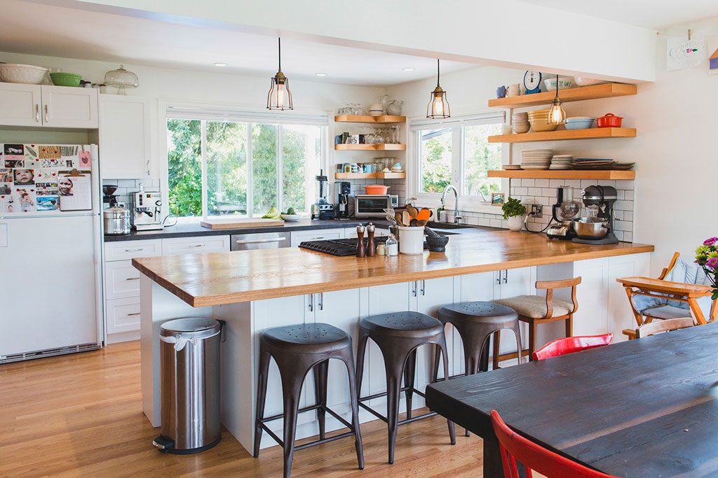
One important design consideration for MacLeod is stove placement. For entertaining and family interaction, he recommends putting the stove in the middle of the kitchen or in an island that faces the living space. “We placed the hood fan flush with the ceiling to keep the view streamlined and open. Custom stainless shrouds avoid the discolouration you would get from just having a duct that goes into the ceiling. I have done this in several kitchens now and love the flexibility it provides for stove placement.”
For long term consideration, the interior of the cabinets were done with high quality materials while the exteriors are replaceable, PVC-wrapped, white shaker style doors which were cost-effective and durable for kids and pets.
Keeping with an organic feel, a white oak top was used on the stove counter and charcoal dyed concrete for the rest of the counter space. A natural tung oil finish was applied which is completely food safe as long as you use pure tung oil. “It’s a malleable finish and makes the concrete look like an old world pizza stone, it’s dark with movement and irregularities,” adds MacLeod.
Essential to MacLeod’s kitchen design was a peninsula wide enough for both cooking and eating comfortably. The peninsula has 24 inch cabinets all the way down and 12 inch cabinets for pantry storage along the backside. With doors, overhang, and space for knees and stools, the peninsula became 52 inches and a space where kids can sit and do homework and visit while the parent is cooking.
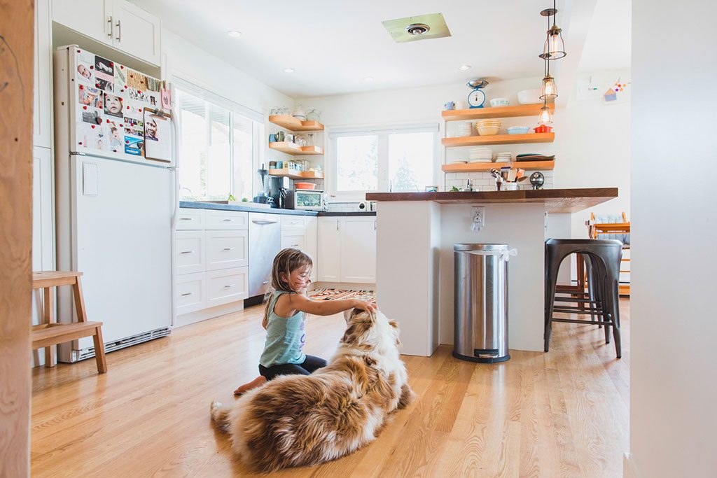
Half the flooring was pulled up from the original house and a mixture of salvaged and new red oak was matched and laced together for a seamless finish. Bona clear finish was used by Martinez flooring for easy care and protection.
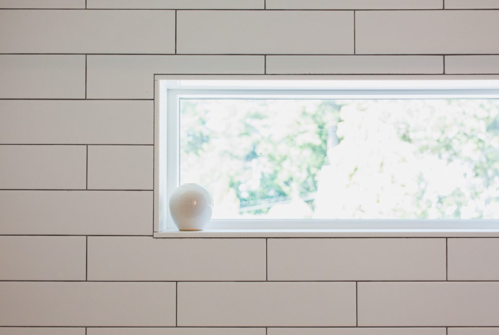
Details were more extensive in other areas of the house so for this busy family their approach for the bathrooms was to keep them straight-forward with simple, durable finishes. They wanted the bathrooms to be utilitarian, easy to use and to clean. White subway tiles with black grout for the shower, large tile on the floor with as few grout lines as possible, splash with concrete, and salvaged pieces to accessorize to keep it warm and inviting.
Upstairs a spacious, natural-light filled office accommodates two separate work spaces and the red oak flooring maintains the streamlined appeal.