Words by Adrienne Dyer. Photos by Jody Beck.
An abandoned renovation by the previous owners of this Oak Bay bungalow became the site of a couple’s dream home in the making. The family- friendly neighbourhood was perfect and, typical of a midcentury bungalow, the bones were solid. The house just needed an expert design eye and an experienced builder to bring the owners’ vision to life. The couple hired Britt Nijs at Spot Design Co. and Paul Cosgrave from Cosgrave Construction to transform the bungalow.
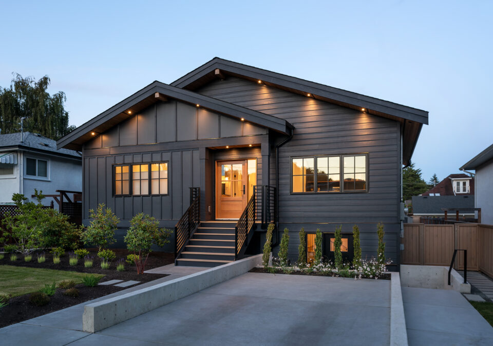
From the street, the original facade blends in perfectly with the other quaint bungalows and required a few aesthetic updates. However, the interior was a completely different story. The 2059-square-foot house had been gutted, down-to-the-studs, and a renovation had been started and deserted.
“The beginning of construction meant undoing a lot of the renovation work that had previously been started and turning our attention to the structural changes that had to happen in order to accommodate the new design,” says Cosgrave, who removed the roof and started from the ground up with the new structural elements and installed vaulted trusses on top.
“The homeowners didn’t want the modest floorplan to feel like an average mid-century home,” says Nijs, who states that “conceptually, they wanted the home to feel organic and clean with a lot of natural light” and worked with the clients on concept boards to narrow down the Scandi-inspired images they had collected.
Within the existing floorplan, the design brief included four bedrooms (the fourth acting as an office when not in use), three bathrooms and a recreation space in the basement. “It was important for the couple to create the impression of spaciousness so the layout became a puzzle to solve,” says Nijs, who knew a wall of windows along the back would create the illusion of more space and form a seamless connection to the outdoor living space.
Nijs designed an entrance that would draw you into the main floor’s airy open plan as a kind of breathtaking reveal. She recommended cream-washed white oak floors throughout the space and on the millwork to maintain a sense of continuity and flow on the main floor.
Vaulting the ceilings to twenty-three feet in the living area, where low ceilings and closed off rooms once existed, was integral to the home’s new feel,” adds Nijs, who adds that the owner loved the look of beams that extend from the indoors out to create a feeling that the interior naturally continues to the outdoors.
Small doses of champagne bronze and black on the hardware and cement stucco on the fireplace facade inject warmth and contrast into the gallery white space.
Nijs designed the stairs and railing to be open so you get a sense of connection between the main floor and the lower level while dead space under the stairs was converted into a wine room. “A mudroom, guest bedroom and rec room downstairs add liveable space in what was unusable space in the previous home,” says Cosgrave.
In keeping with the Scandinavian theme, the facade in Benjamin Moore, black panther creates drama before entering the light-infused interior. Cosgrave adds that “durable Hardie plank siding on the exterior, along with TimberTech decking for the deck, provide the homeowners with long lasting looks and performance.”
“I love the challenge of repurposing what was an unremarkable floorplan in a standard Victoria bungalow and transforming it into a contemporary home within the same structure – no additions, just repurposing the existing 2059-square-foot space,” says Cosgrave who likes to think of the project as a beautiful reincarnation.


