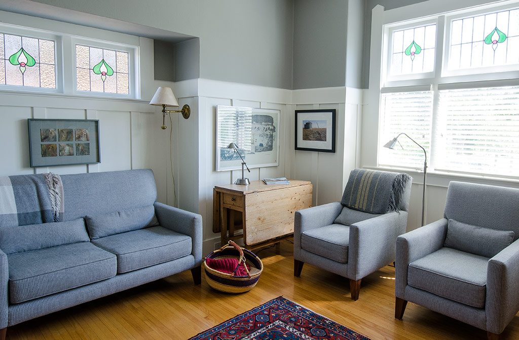
Eclectic design redefines the rule book of interior design and showcases rooms that exude that effortless sensibility of having been assembled over the years. Still adhering to the fundamentals of good design, eclectic design allows you to combine aged and new pieces to create rooms that are livable, inspiring, and uniquely you. Inviting harmony through contrast, eclectic design doesn’t follow a particular era or style but finds a common ground to make a home coalesce. An obvious place to start when mixing pieces is to consider the era of the home and each room’s architecture.
Marilyn and Brian Wallace opened their door to MHV to shine the light on their turn of the century, visually exciting Gonzales home. It is apparent in the Wallace’s home that the era of matchy-matchy design is long gone. Their bold decor bridges design styles and sensibilities across decades, blending wood finishes, scale, and texture in a single room to create a layered look that radiates a unique richness and depth. Merging furniture they’ve collected over the last 45 years with unique global finds and striking art work, the Wallace home draws its energy from contrast. “It’s been fun to mix our old Canadiana pieces from Ottawa with our new, modern and midcentury pieces. I wanted to create beautiful spaces infused with natural light and accented with art, where people can come in and feel comfortable. We push the design until it works but we both love working with it so it’s been fun for us.”
The previously dark and gloomy, 1910, character home, was extensively renovated before they moved in fourteen years ago. “Working with Ernest Hanson, of Ernest Hanson Design, we opened up the entire space to let in more light and create a spacious feel.
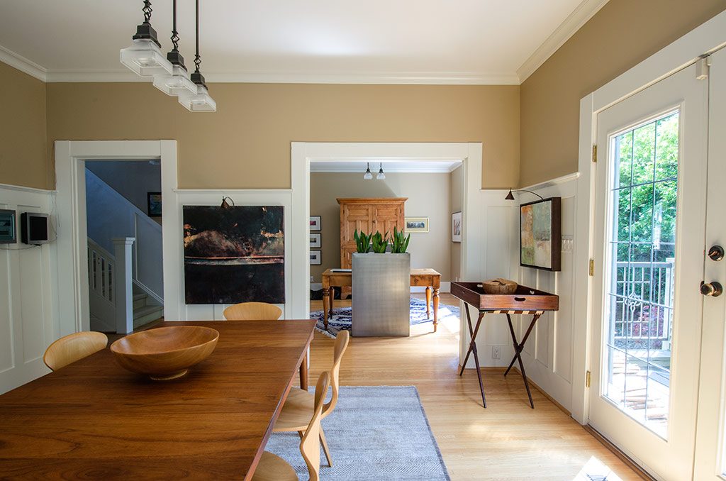
Some of the features of the original layout were really quite contemporary for the era and we wanted to maintain some of its original charm so we kept features like the wide entranceways, for example. Originally it was full of dark muted colours, it just didn’t feel like a happy house, and now the light is incredible and gives me pleasure every day,” muses Wallace. Designed by Danish Architect and designer, Finn Juhl for France and Sons, the teak dining table‘s depth is heightened is the natural-light infused space.
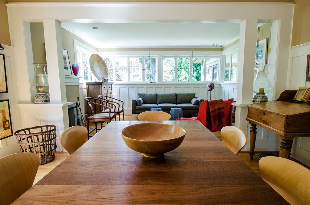
Embracing the character of the architecture, the Wallace’s have primarily incorporated pieces from both the turn of the century and from the midcentury while boldly blending contemporary pieces with global patterned rugs and throws, rustic baskets, and over-sized ceramics to create an eclectic space that celebrates pattern, colour, and texture.
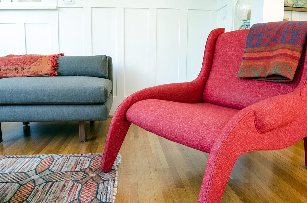
The red Italian Antropus chair by Marco Zanuso, 1949, was Zanuso’s first experiment with latex foam, as well as Arflex’s first chair design. Arflex, a division of the Pirelli company, commissioned Zanuso to experiment with the new material and the resulting Antropus Chair was used in the Antropus Family opera, hence the chair’s name. The frame is constructed from solid wood and dressed in a polyurethane rubber coating.
Ming-style chairs, manufactured for Nienkämper, add to the midcentury, scandinavian aesthetic, and adds extra seating for entertaining. The darker-toned wood furniture grounds the light oak floors in this neutral-toned room. They grey rug beneath the dining table creates a canvas for the midcentury modern table allowing it a presence against the oak flooring.
“I started painting with mixed media, using bees wax, about eight years ago. I loved working with bees wax and then I spent some time with my daughter, who resides in Portland Oregon, the hub of encaustics, and everything changed for me there. I have been doing encaustics ever since. All other art we have in our home we’ve purchased from British Columbian artists.”
As a painter, garden designer and photographer, it is obvious that design fundamentals are not completely foreign to Wallace. “I would say that I approach all of these mediums with the same instincts; colour, placement, juxtaposition, and contrast of elements all come pretty naturally to me. That’s certainly what I love to work with anyway.” I didn’t necessarily grow up in an artistic family, I think my design sense has developed over the years largely by just engaging in these mediums and observing things wherever I am. I only started painting about eight years ago and I think the urge to start was a continuation of what I was doing in garden design and withphotography. We’ve been fortunate enough to travel quite extensively and my inspirations are from public landscape architecture and design in Europe and the United States.”
An ongoing fascination with that space where landscape and architecture meet, Wallace attributes part of her inspiration to living on the southern-most tip of Vancouver Island. “We live in one of the most beautiful parts of the world and I find the light and the natural beauty here really inspiring. My husband and I have always been interested in architecture and design so it comes naturally for us to consider these elements and incorporate them into our own aesthetic. Brian is just as enthusiastic about design as I am so that’s been fun for us,” smiles Wallace.
Both renovations have been positive experiences, and as Wallace emphasizes, the experience really depends on who you work with. Steve Smith at SC Smith Building oversaw both renovations and he was really a pleasure to work with. “I do all the specifications myself but I am definitely not without a crew. Ernie has been incredibly helpful with what we wanted to accomplish in our basement renovation. I knew the look I wanted but I was going in the wrong direction. I just knew something wasn’t right and Ernie helped me figure out which way to go.
I don’t know about things like large vertical tiles and he was very knowledgeable with all the technical details. He helped me blend materials like the metal detail with wood, thin lines for pendants, and the monochromatic palette that was perfect for highlighting art and bold colours. Overall, we wanted a greater sense of space, to maintain the character appeal of the era with a modern, European feel and we are very satisfied with the result.”
“The main floor of the house had a great layout so we wanted to maintain the cozy, separate room feel, yet open it up further to let even more light in. We renovated again four years ago and took out a very dangerous set of basement stairs and added an addition off the kitchen with stairs. The addition on the back of the house offered the solution to everything we felt was lacking in the house. It gave us a pantry with more kitchen storage, a preparation space, better access to the garden, and a beautiful back entrance with banquet and foyer. At that time, we added a guest suite in the basement accessible from the foyer,” states Wallace.
“At one point in our renovation, laughs Wallace, we decided we’d had enough of 1910 houses and wanted to get more modern with it. So as you approach the banquet toward downstairs, things start to get a little more contemporary with glass and metals. It’s a big surprise every time you go downstairs,” laughs Wallace.
“An integral part of the modern aesthetic was the stairs leading down to the basement. The floating stair design was my husband’s concept; he worked with Ernest Hanson, our architectural designer, to bring his vision to fruition.” The utilitarian, sustainable, polished concrete floors unifies the contemporary feel downstairs and maintains the neutral palette to highlight Wallace’s paintings.


